Seeing Differently: The Designer Who Couldn't See Red — And Revolutionized How America Views Color
The Rejection That Sparked a Revolution
David Chen remembers the exact moment his world shifted from disappointment to possibility. It was 1963, and the admissions officer at Pratt Institute was explaining, with what seemed like genuine sympathy, why Chen's portfolio—despite its obvious talent—couldn't earn him a spot in their prestigious graphic design program.
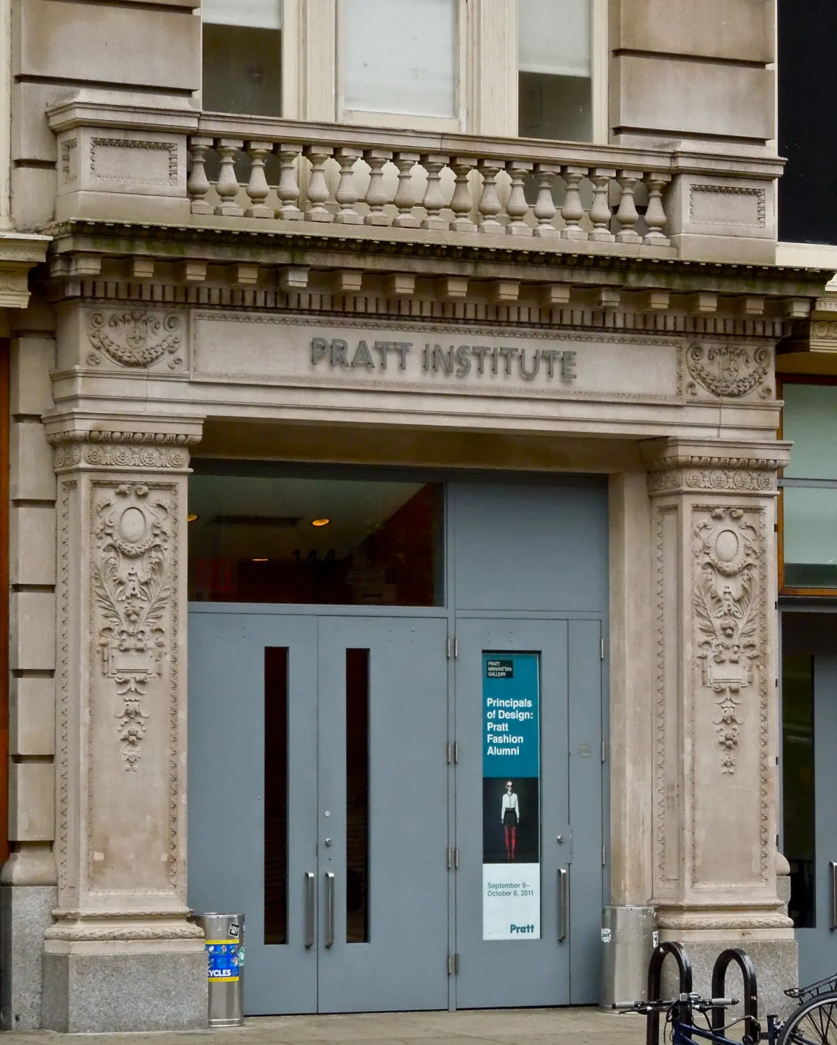 Photo: Pratt Institute, via photos.wikimapia.org
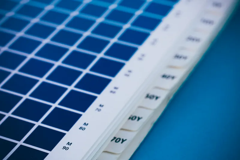
 Photo: David Chen, via afterva.com
"Your color work is... unusual," the officer said, shuffling through Chen's submissions. "We can't admit someone who can't distinguish basic color relationships. It wouldn't be fair to you or your future clients."
Chen nodded politely, gathered his rejected portfolio, and walked out into the Brooklyn afternoon. What the admissions officer didn't realize was that he had just forced one of the most innovative color theorists in American history to find a completely different path to the same destination.
A Different Kind of Vision
Chen's condition—protanomaly, a rare form of red-green color blindness affecting less than 1% of the population—meant that colors others saw as distinct appeared nearly identical to him. Red roses looked brown. Green traffic lights appeared white. The vibrant autumn foliage that inspired poets left Chen seeing a world of muted yellows and grays.
For most people, this would have ended any dreams of a career in visual design. For Chen, it became the beginning of an entirely new way of understanding color.
"I couldn't trust my eyes the way other designers did," Chen explains from his studio in San Francisco, now 78 and still working. "So I had to learn to trust numbers, relationships, and systems instead. It turned out to be the best thing that ever happened to me."
Building a Mathematical Language for Color
Rejected from traditional art education, Chen enrolled in the mathematics program at City College of New York while working nights at a small printing company in Queens. It was there, surrounded by color separations and printing plates, that he began developing his systematic approach to color relationships.
While other designers chose colors based on intuition and visual appeal, Chen created mathematical formulas that predicted how colors would interact. He measured wavelengths, calculated contrast ratios, and developed charts that mapped color relationships with scientific precision.
"David would come in with these elaborate graphs and equations," remembers his former supervisor at the printing company. "We thought he was overcomplicating everything. Then we started using his color combinations, and our print jobs looked better than anything our competitors were producing."
Chen's breakthrough came when he realized that his condition allowed him to see color relationships that others missed entirely. Without the distraction of conventional color perception, he could focus purely on contrast, saturation, and luminosity—the fundamental building blocks of effective visual communication.
The Television Revolution
Chen's big break came in 1967 when CBS was struggling with the transition to color television broadcasting. The network's designers were having trouble creating graphics that looked good both in color and on the black-and-white sets that still dominated American homes.
Chen's mathematical approach to color provided the perfect solution. His system ensured that color graphics maintained their clarity and impact even when viewed without color information. Within months, CBS had hired him as a consultant, and his color standards became the template for television graphics across all major networks.
"Chen understood something that the rest of us missed," says former CBS executive producer Margaret Walsh. "Color television wasn't just about adding color to existing designs. It required completely rethinking how visual information worked."
Chen's influence extended far beyond television. His color systems were adopted by major corporations looking to ensure their branding worked across different media. Companies like IBM, Coca-Cola, and McDonald's used Chen's mathematical models to create color schemes that remained consistent whether viewed on television, in print, or on early computer screens.
The Science of Everyday Color
By the 1970s, Chen had established himself as America's leading authority on systematic color design. His consulting firm worked with everyone from package designers to architects, helping them create color schemes based on scientific principles rather than subjective preference.
One of his most influential projects involved redesigning the color coding system for American hospitals. Chen's research showed that traditional color choices for medical environments—chosen primarily for their "calming" psychological effects—actually made it harder for staff to quickly identify important information.
Chen developed a color system based on contrast optimization and cognitive processing speed. His hospital color standards, implemented nationwide in the 1980s, are credited with reducing medical errors and improving patient outcomes. The system is still in use today.
The Unexpected Advantage of Limitation
Chen's story challenges fundamental assumptions about disability and capability. His color blindness, initially seen as a disqualifying limitation, became the very thing that made his contributions possible.
"I never saw color the way other people did, so I never got trapped by conventional ideas about what colors 'should' look like together," Chen reflects. "I had to build my understanding from first principles, which turned out to be much more reliable than trusting intuition."
This systematic approach proved especially valuable as technology evolved. While other designers struggled to adapt their color choices for computer screens, digital printing, and eventually web design, Chen's mathematical models translated seamlessly across different media.
Legacy in Living Color
Today, Chen's color theory is taught in design schools across the country—including Pratt Institute, which now proudly claims him as an honorary alumnus. His mathematical approach to color relationships forms the foundation for digital color management systems used by every major software company.
More importantly, Chen's career opened doors for other designers with disabilities, proving that different ways of seeing the world can lead to revolutionary insights. Design schools that once rejected students with visual differences now actively recruit them, recognizing that diverse perspectives lead to better solutions.
Seeing Beyond Sight
Chen's influence extends far beyond professional design. His work helped establish the principle that accessibility and innovation aren't opposing forces—they're complementary ones. By designing color systems that worked for people with different types of vision, he created solutions that worked better for everyone.
"The irony wasn't lost on me," Chen says with a smile. "I became known as a color expert precisely because I couldn't see color the way everyone else did. Sometimes the best way to understand something is to approach it from completely outside conventional wisdom."
At 78, Chen continues to work on color problems, now focusing on designing visual systems for aging populations and people with various forms of visual impairment. His latest project involves creating color standards for autonomous vehicles—ensuring that important visual information remains clear regardless of the viewer's color perception abilities.
David Chen's rejection from art school in 1963 seemed like the end of his design dreams. Instead, it was the beginning of a career that would fundamentally change how America sees and uses color. Sometimes the most valuable perspective comes from those who see the world differently—not despite their limitations, but because of them.